UX and UI Design for a friendly educational app
PolyUp is a 3D platform that enables kids to make games and interactive experiences. In this case study, we highlight the wrapper interfaces of the web-app and show how users (students and educators) interacted with each other outside the 3D experience.
Brief
Building on the visual identity fully developed 6 months earlier, I took the role of the UX Designer to bring the app closer to what it needs to be.Glossary
- Machine: 3D interactive experience involving robotics.
- Chip: Special 3D objects that bring logic and motion to Machines.
- Block Scripting modules that stacked on top of each other to create algorithms
Project Goals
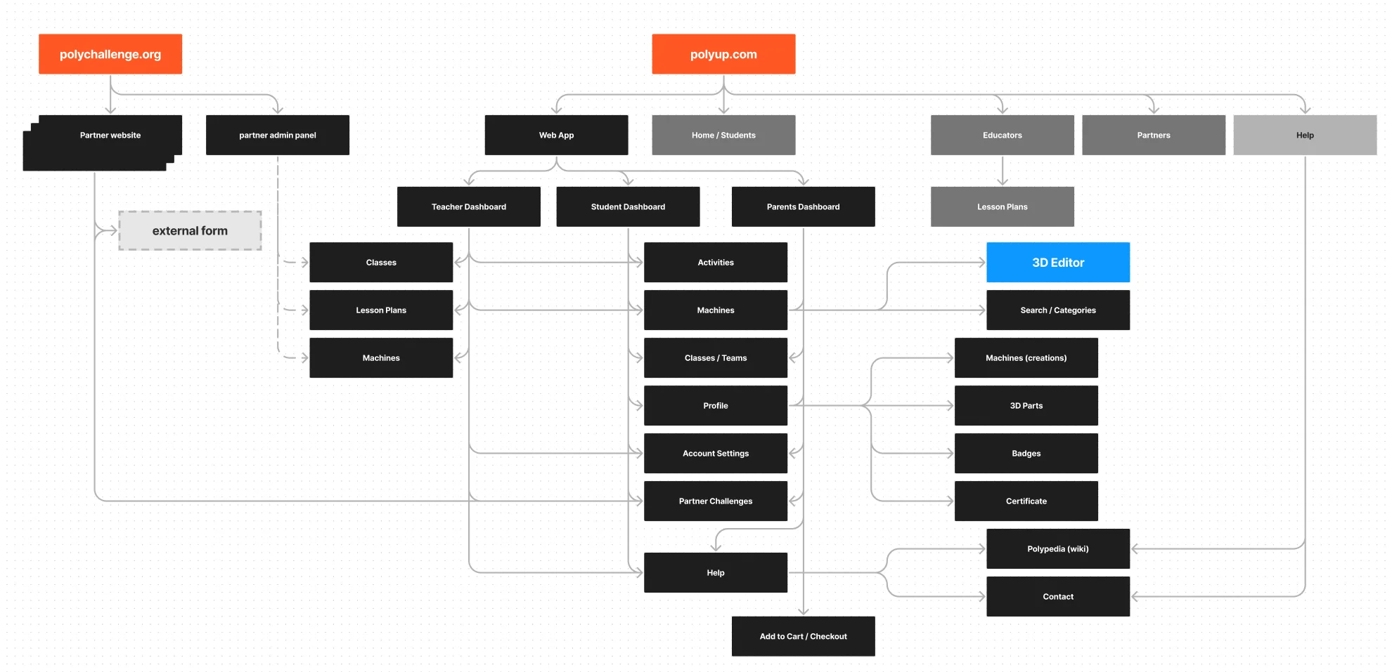
- Information Architecture: Create sitemaps to visualize the hierarchy of pages and their relationships.
- Wireframing: Develop low-fidelity wireframes to outline the layout and basic elements on each screen
- User Flows and Journey Mapping: Map out the paths users will take through the app to achieve specific tasks or goals.
- UI DesignCreate user interface design system and guidelines.
- Visual Design Develop custom icons and illustrations.
- Responsive Design Design the app to be responsive, adapting to different devices.
- Email Design Design emails to be consistant with the visual language of the web app.
- User Testing and Feedback Iteration Continuously gather user feedback and insights to make iterative improvements to the app.
Strategy
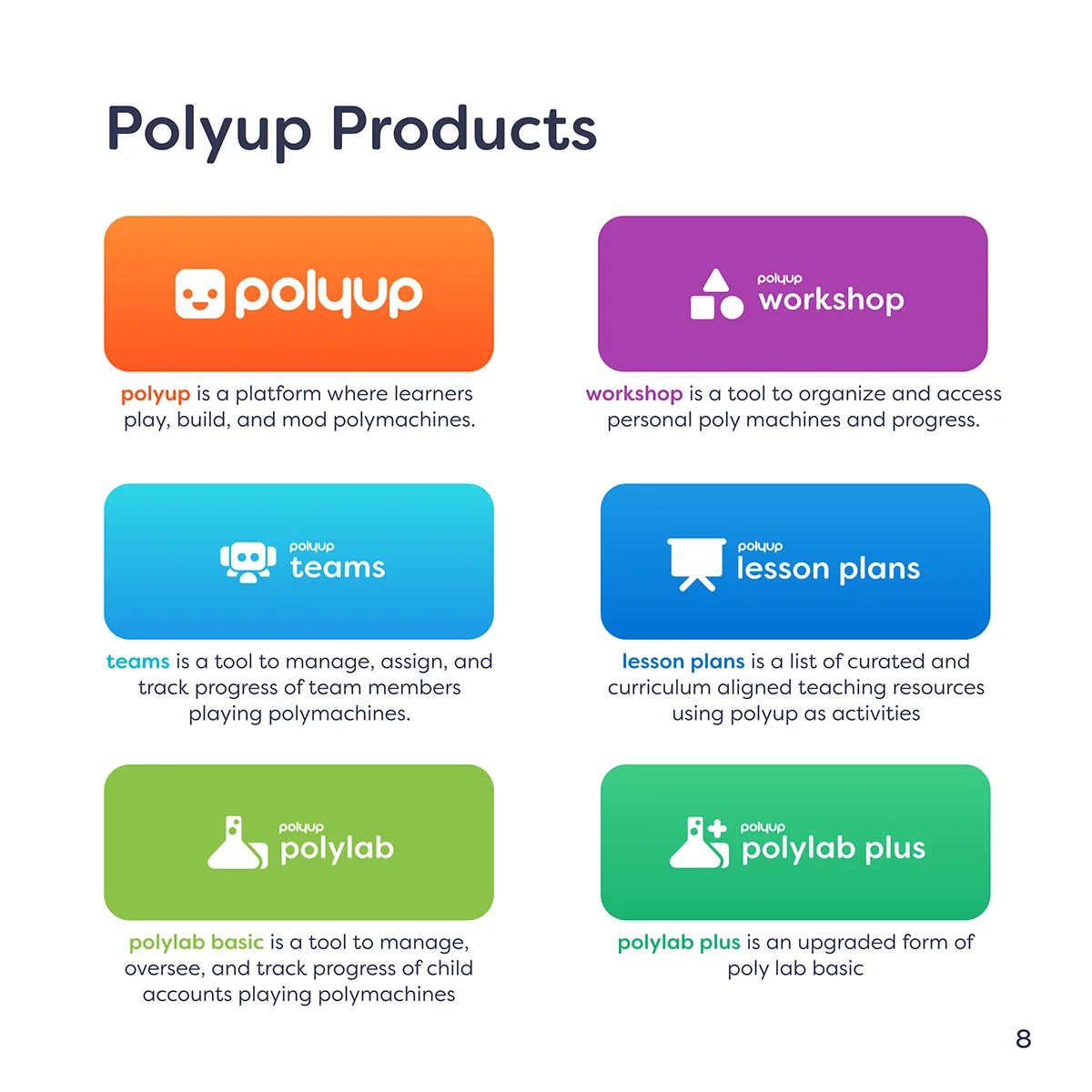
Direct communication with users proved instrumental in paving the way to make a usable product loved by both students and educators. With the use of minimal text, colorful elements, clear objectives and interfaces.Products
The app platform had 2 main personas to work with, educators and students, each one have their own interface and content. In addition, other stakeholders will use a version of the platform including parents, superintendents and district managers.
Design System
PolyUp is a tool used in schools, organizations, and homes. As many professionals including external partners work on the platform, it is crucial to create a consistent and coherent experience across all platforms.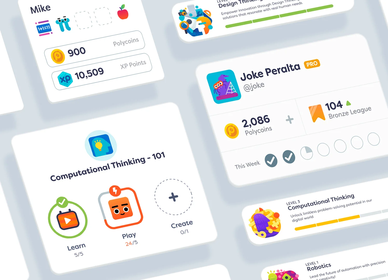
Color
Orange was selected as the main color for kids interfaces, Orange is a color that exudes enthusiasm and creativity while also symbolizing a sense of adventure and curiosity. However, educators used the app differently, mainly for planning and interpreting data. Due to its calming and authoritative qualities, Blue was selected for educators fostering focus and facilitating clear communication.
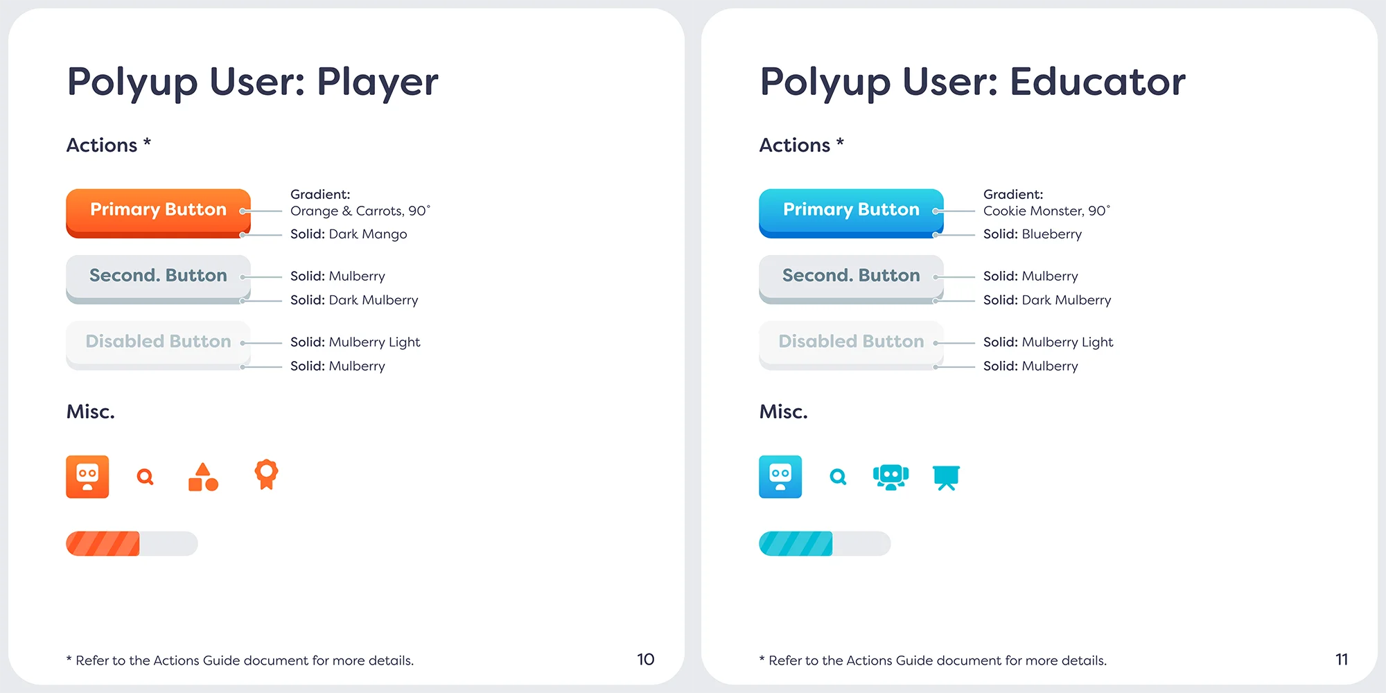
Buttons
Buttons are the primary means by which a user navigates an app. Therefore, it is important that the app clearly communicates the available options and differentiates them based on their level of importance.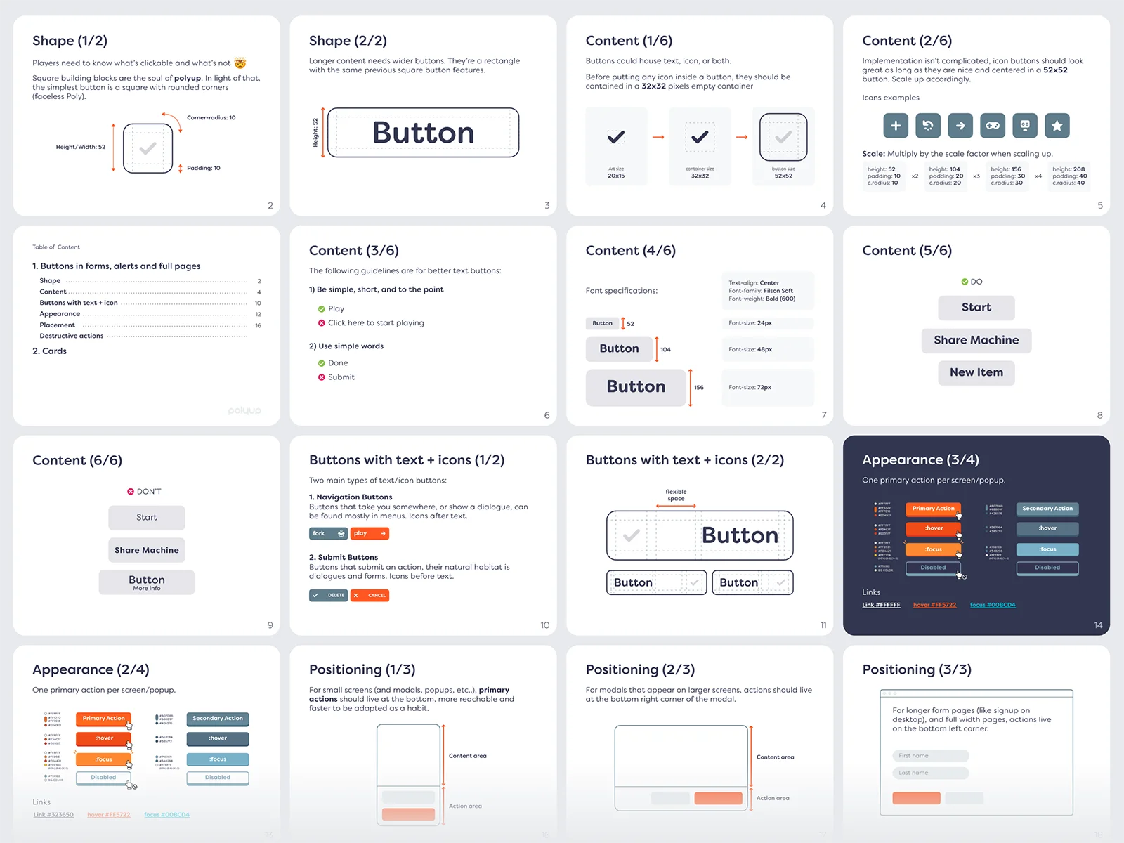
Not every action is created equal. For example, cards, links, and other actionable components exist throughout the app, including but not limited to the platform, emails, and surveys. To ensure consistency across all platform products, a special Action Design document was created to serve as a guideline for designers and engineers.
Icons and Emojis
500+ custom icons and emojis were created to accommodate the growing needs of the game platform. The primary use of the icons is user interfaces and discord server customer icons.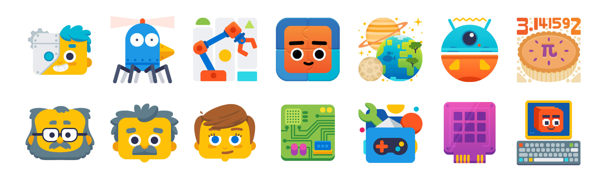
Popups
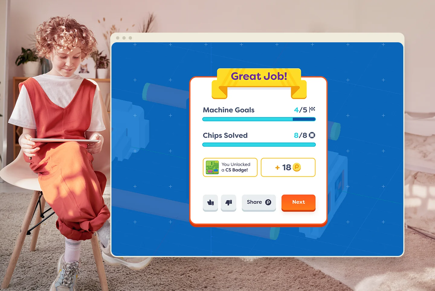
In contrast to modals, popups are concise, targeted messages that convey a single, clear message. They typically include no more than two interactive options - one primary and one secondary. Big moments presented larger and content rich popups.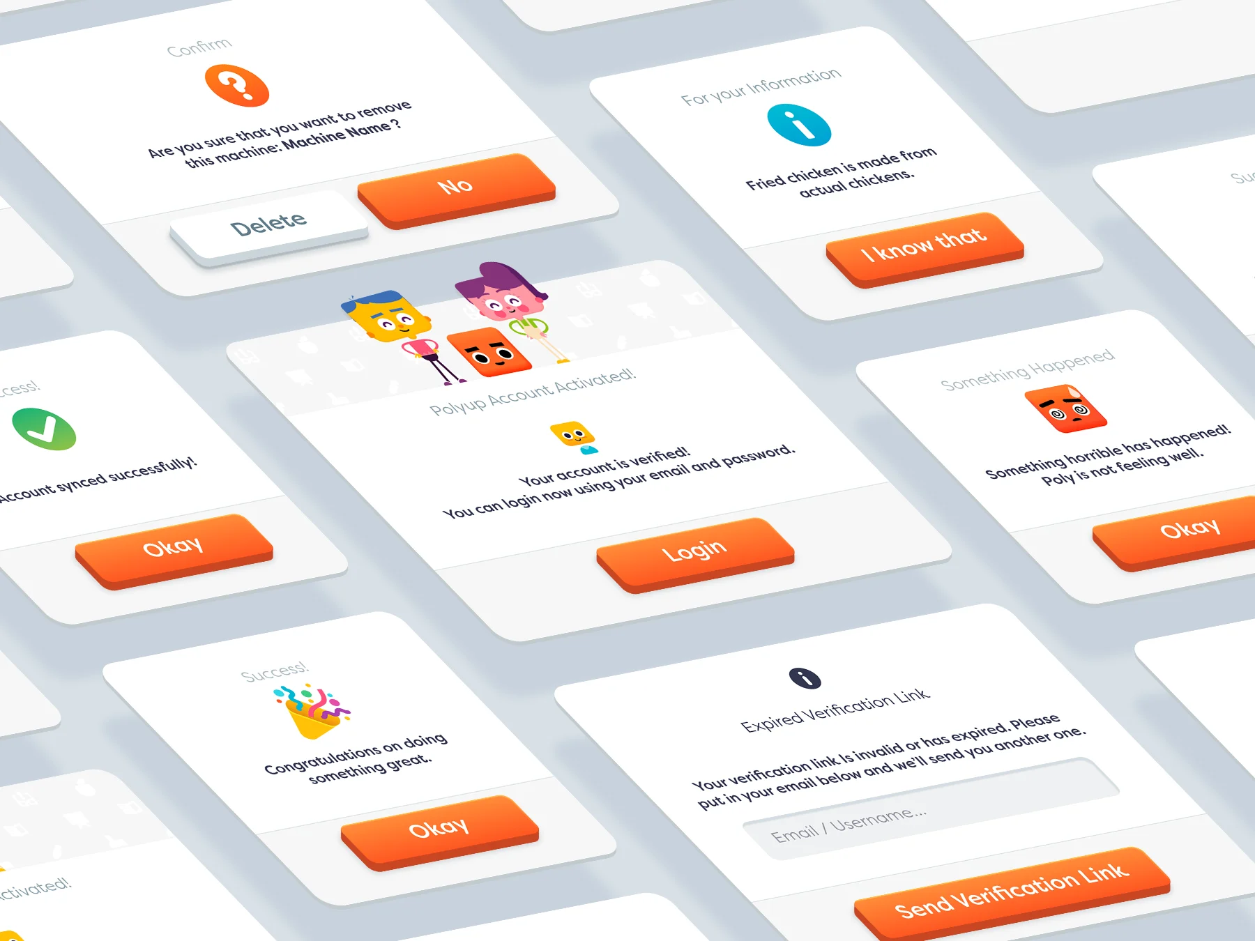
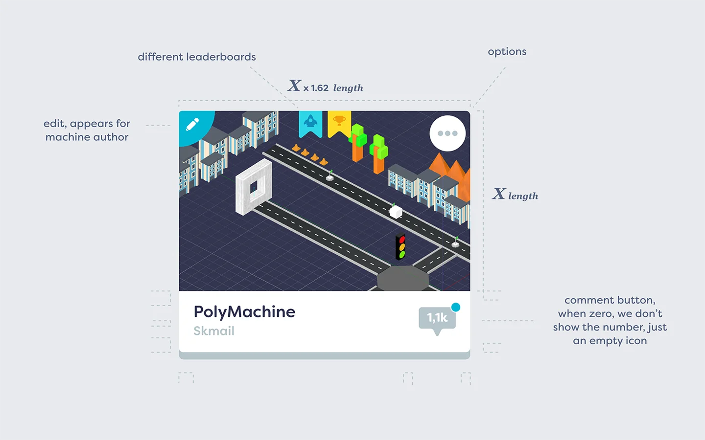
Game wiki
Due to the large number of blocks, their versatility, and varying usage, documentation for the whole platform blocks and 3d objects was created. Users could easily lookup details about any block from within the app in a compact window anywhere in the app, and is more accessible in the Chip editor.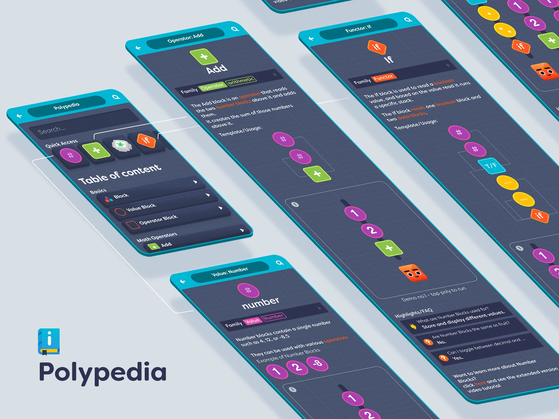
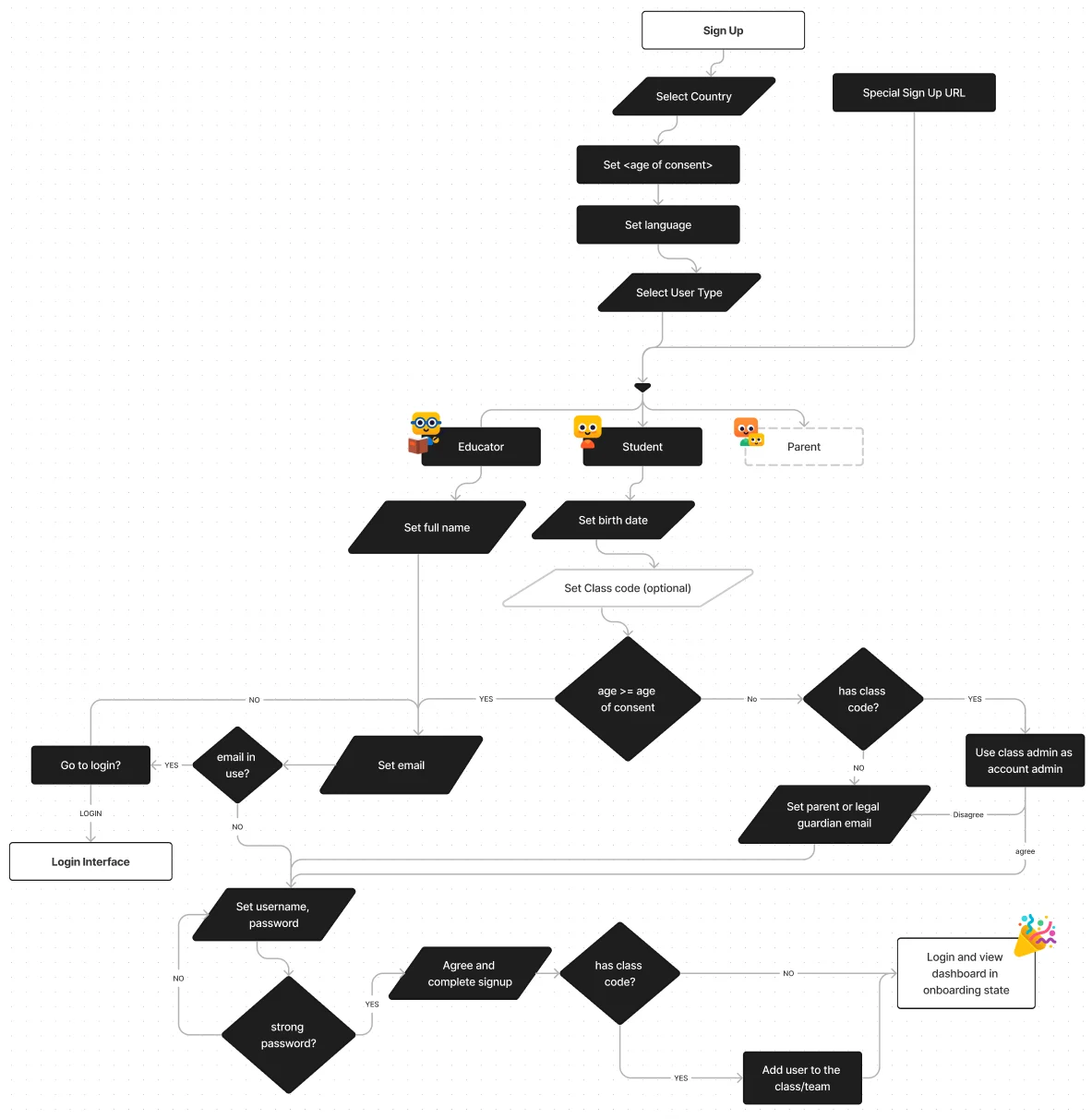
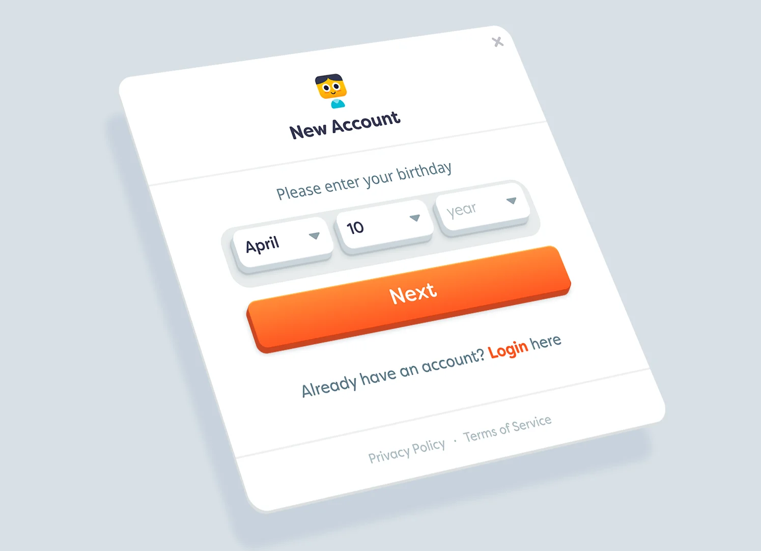
Signup process
Signup process involves 3 main user types: students, educators, and parents. Each user group has its own set of requierments varying based on age and country.
Dashboard
Student
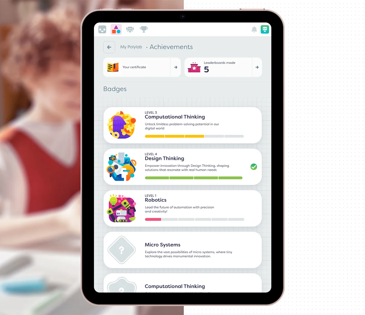
Students can play on their own, or as part of a class. They discover and create Machines, as well as earn coins and points, access curriculum Machines, unlock badges, and be featured in leaderboards. It was necessary to have a modular design to make sure that the same visual language is used when a user has a free or premium accounts.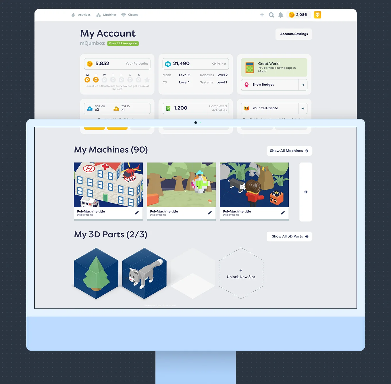
Onboarding
First time users were greeted with a clutter free interface and would unlock systems once they become relevant and they are more familiar with the platform. For example, the badges card appears after a user earns their first badge.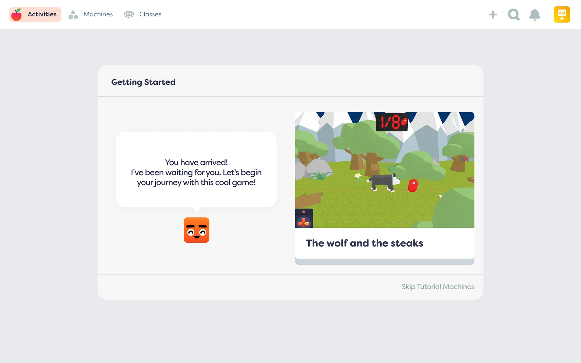
Educator
The educators interface uses similar language to that of students. However, they get more control and data-heavy insights to give them a birds-eye view of the classroom and useful data that fuels their decision making in class.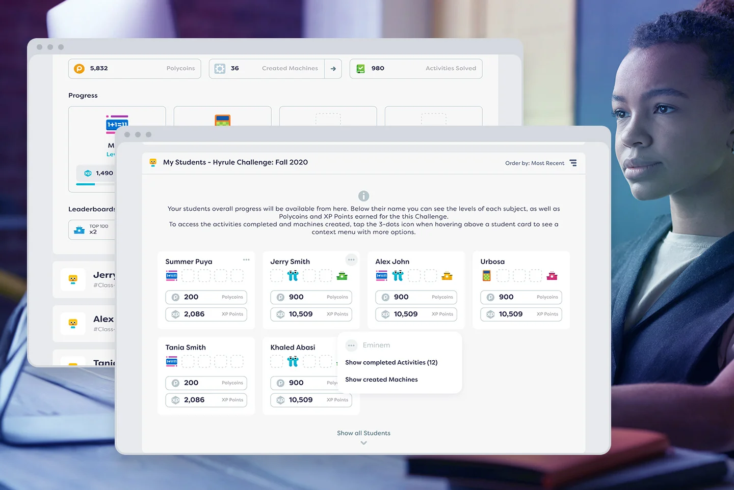
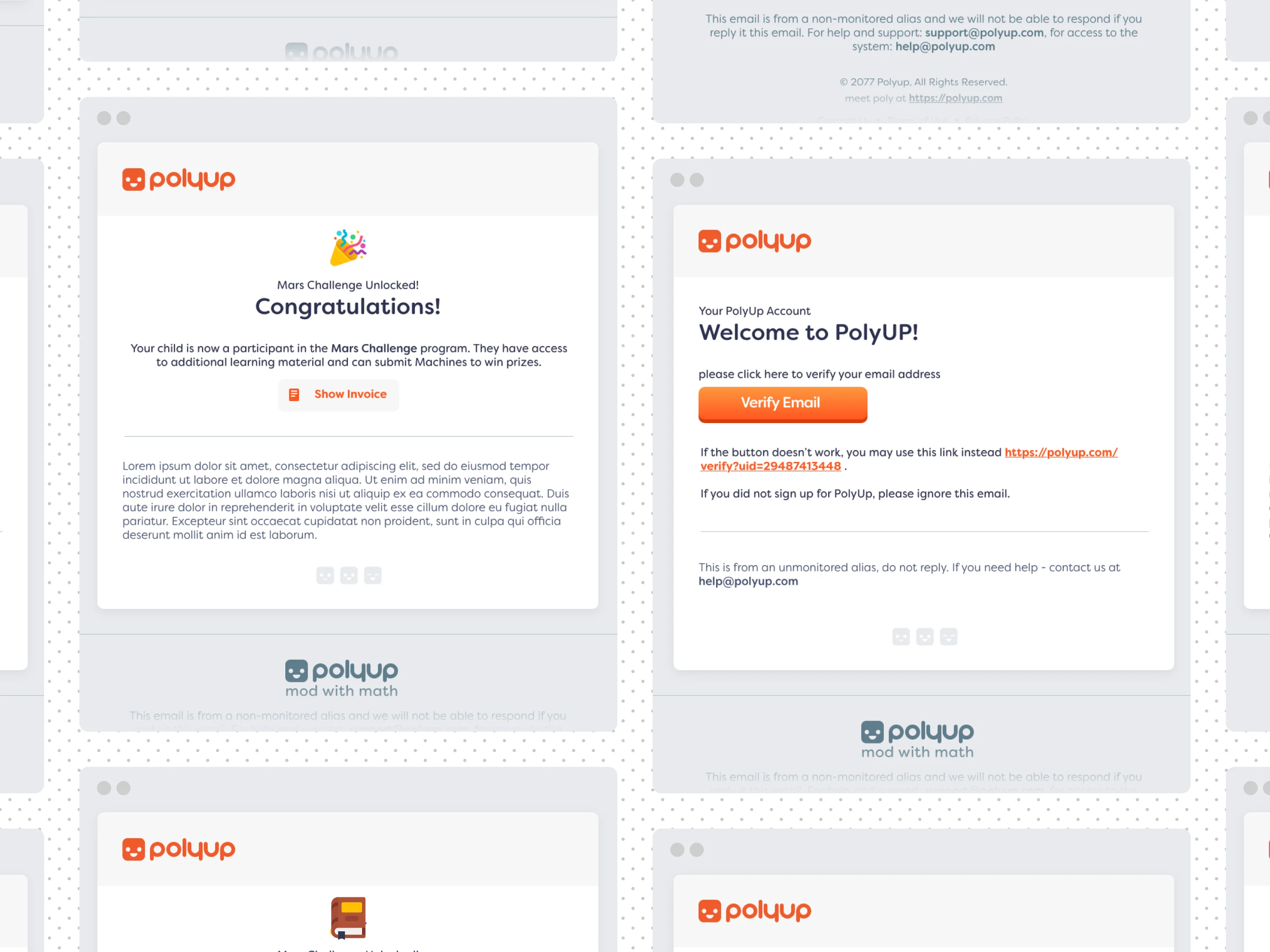
Email Design
Design system for emails was developed to unify the internal and system emails with marketing, newsletter, and all email based communication with our users.That included a unified header and footer for all emails, and the use of design language similar to the platform in terms of color, typography, margins, and tone.